dfvad decomposes value added growth into explanatory
factors. A cost constrained value added function is defined to specify
the production frontier. Industry estimates can also be aggregated using
a weighted average approach.
dfvad is available from https://github.com/shipei-zeng/dfvad. To install it,
install_github from the devtools package can
be helpful.
devtools::install_github("shipei-zeng/dfvad")If error messages show that the URL cannot be opened, please set the download option before installing it.
options(download.file.method = "libcurl")If error messages show that schannel failed to receive handshake, please delete the previous package before updating it.
It has also been uploaded to the CRAN repository, which can be downloaded using:
install.packages("dfvad")value_decom() for decomposing nominal value added growth
identifies the contributions from efficiency change, growth of primary
inputs, changes in output and input prices, technical progress and
returns to scale.
library(dfvad)
# Use the built-in dataset "mining"
table1 <- value_decom(c("h2","x2"), c("w2","u2"), "y2", "p2", "year", mining)[[1]]
head(table1)
#>   period     value     alpha      beta     gamma efficiency   epsilon      tau
#> 1   1991 1.0869517 1.0287049 0.9944262 1.0000000  1.0000000 1.0000000 1.062544
#> 2   1992 0.9960608 0.9523963 0.9874494 1.0000000  1.0000000 1.0000000 1.059140
#> 3   1993 1.0477108 1.0373754 1.0180111 0.9997303  0.9923619 0.9923619 1.000000
#> 4   1994 0.9773035 0.9605188 1.0444275 0.9996838  0.9670585 0.9745018 1.000000
#> 5   1995 1.0545680 0.9842271 1.0168128 0.9999874  1.0000000 1.0340636 1.019052
#> 6   1996 1.1345729 1.0406754 1.0327427 1.0000000  1.0000000 1.0000000 1.055662
#>        TFPG
#> 1 1.0625440
#> 2 1.0591398
#> 3 0.9920943
#> 4 0.9741937
#> 5 1.0537516
#> 6 1.0556623
table2 <- value_decom(c("h2","x2"), c("w2","u2"), "y2", "p2", "year", mining)[[2]]
head(table2)
#>   period    value         A         B         C         E        T      TFP
#> 1   1990 1.000000 1.0000000 1.0000000 1.0000000 1.0000000 1.000000 1.000000
#> 2   1991 1.086952 1.0287049 0.9944262 1.0000000 1.0000000 1.062544 1.062544
#> 3   1992 1.082670 0.9797347 0.9819455 1.0000000 1.0000000 1.125383 1.125383
#> 4   1993 1.134325 1.0163527 0.9996314 0.9997303 0.9923619 1.125383 1.116486
#> 5   1994 1.108580 0.9762259 1.0440425 0.9994142 0.9670585 1.125383 1.087673
#> 6   1995 1.169073 0.9608280 1.0615958 0.9994016 1.0000000 1.146824 1.146138
t_weight() follows a “bottom up” approach that uses
weighted averages of the sectoral decompositions to provide an
approximate decomposition into explanatory components at the aggregate
level.
library(dfvad)
# Use the built-in dataset "sector"
table1 <- t_weight("y", "p", "industry", "year", "alpha", "beta", "gamma", "epsilon", "tau", sector)[[1]]
head(table1)
#>   period     value    alpha      beta     gamma   epsilon      tau      TFPG
#> 1   1991 0.9951654 1.004989 0.9878890 0.9996087 0.9868727 1.016024 1.0023647
#> 2   1992 1.0145281 1.015884 0.9869371 0.9987753 0.9962747 1.016905 1.0118834
#> 3   1993 1.0656435 1.034633 1.0128698 1.0002431 1.0011899 1.015434 1.0168858
#> 4   1994 1.0649234 1.007479 1.0291213 1.0001043 1.0029142 1.024013 1.0271072
#> 5   1995 1.0565961 1.020031 1.0378505 1.0010086 0.9871089 1.010072 0.9980697
#> 6   1996 1.0703334 1.019766 1.0212297 0.9998535 1.0097033 1.018044 1.0277682
table2 <- t_weight("y", "p", "industry", "year", "alpha", "beta", "gamma", "epsilon", "tau", sector)[[2]]
head(table2)
#>   period     value        A         B         C         E        T      TFP
#> 1   1990 1.0000000 1.000000 1.0000000 1.0000000 1.0000000 1.000000 1.000000
#> 2   1991 0.9951654 1.004989 0.9878890 0.9996087 0.9868727 1.016024 1.002365
#> 3   1992 1.0096232 1.020952 0.9749843 0.9983845 0.9831963 1.033200 1.014276
#> 4   1993 1.0758984 1.056311 0.9875322 0.9986272 0.9843662 1.049147 1.031403
#> 5   1994 1.1457494 1.064211 1.0162904 0.9987313 0.9872349 1.074340 1.059361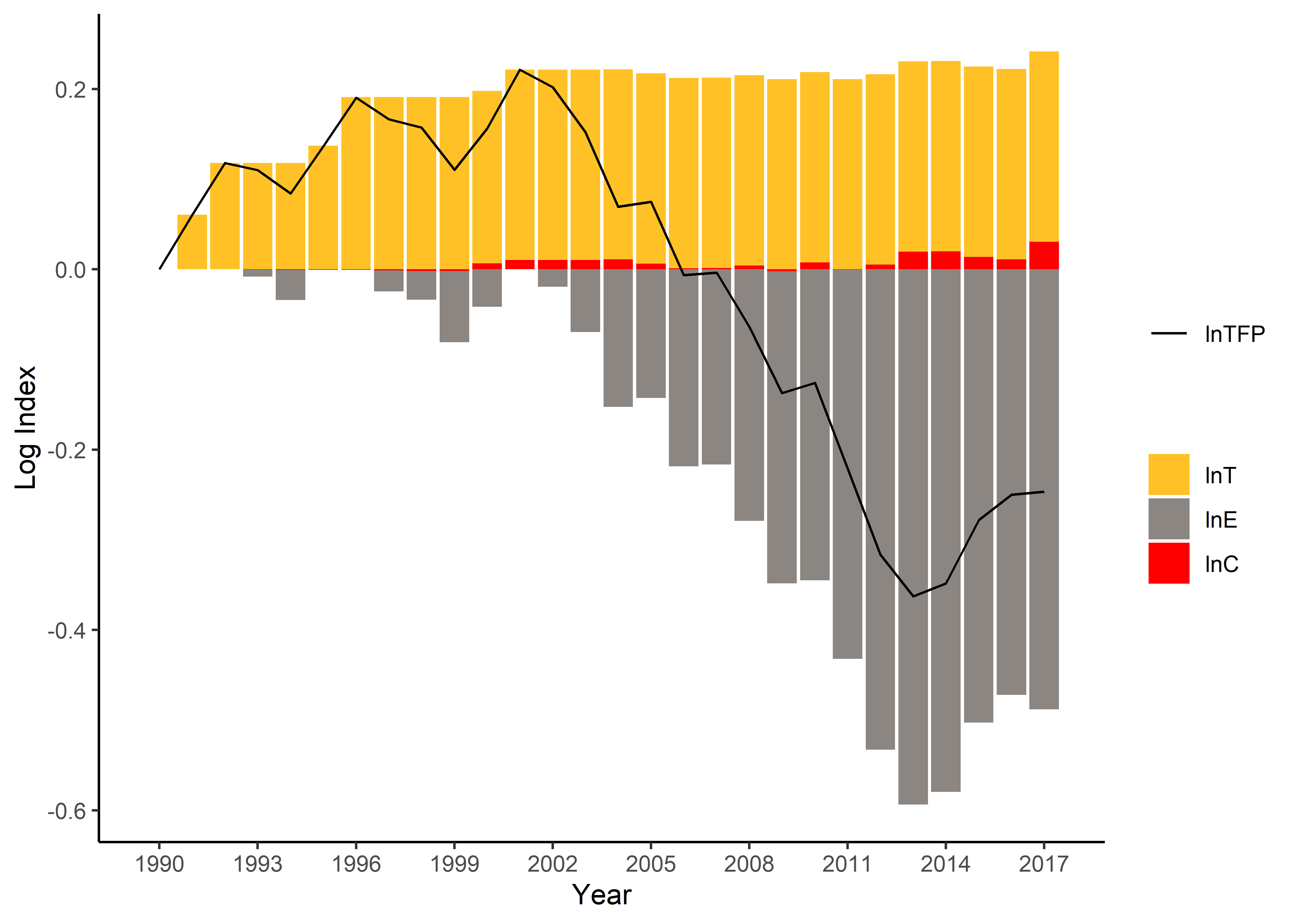
#> 6 1995 1.2105943 1.085528 1.0547575 0.9997387 0.9745083 1.085161 1.057317Here is an example to plot the explanatory factors of productivity
(logarithmic indexes). Additional packages such as ggplot2
and reshape2 are required.
library(dfvad)
library(ggplot2)
library(reshape2)
# Get the decomposition result
df <- value_decom(c("h2","x2"), c("w2","u2"), "y2", "p2", "year", mining)[[2]]
# Extract columns and rename
df_cmpt <- data.frame(df[,"period"], log(df[,c("T", "E", "C")]))
colnames(df_cmpt) <- c("year", "lnT", "lnE", "lnC")
df_tfp <- data.frame(df[,"period"], log(df[,"TFP"]))
colnames(df_tfp) <- c("year", "lnTFP")
# Set the colour scheme
palette_a <- c("goldenrod1", "seashell4", "red")
# Convert data into a tidy form
df_cmpt_tidy <- melt(df_cmpt, id.vars="year")
# Plot the components
plot_out <- ggplot(df_cmpt_tidy) + geom_bar(aes(x=year, y=value, fill=variable), stat="identity") +
        geom_line(data=df_tfp, aes(x=year,y=lnTFP,color='black'), lwd=0.5) +
        ylab('Log Index') + xlab('Year') +
        scale_fill_manual("", values=palette_a) +
        scale_colour_manual("", values=c('black'='black'), labels = c('lnTFP')) +
        scale_x_continuous(breaks = seq(min(df$period), max(df$period), by = 3)) +
        theme_classic()
print(plot_out)